

Coding my own portfolio with HTML/CSS/Javascript
To better communicate with developers, I refreshed my mind on front-end web development by coding my own, responsive online portfolio from scratch.

Overview
The project was to create a simplified version of my online portfolio in order to showcase my skills as a UX designer as well as my recently acquired skills in HTML, CSS, and Javascript. My goal was to create a responsive portfolio in which I could showcase my projects as a UX Designer, talk a bit about myself, and provide accessible contact information.
Context & Challenge
Timeline: 1 month; Feb 2022- Mar 2022.
Background: The project was meant to last about 2 months, although I put in extra time to complete it in one month. I pushed myself to code my first, responsive online portfolio.
Roles: UX Designer & Web Developer
Purpose: As a UX Designer, it is important to effectively communicate with developers and have an understanding of any limitations behind designing a platform, so I decided to immerse myself in a project that would refresh my mind with a hands-on experience.
Problem: Although I did have past experience with html, css, and java from my undergrad experience, I had sat on it for years and wanted to learn more about responsive design & media queries. I needed to create a minimum viable product in a matter of weeks that showed my abilities.
Goal: My goal was to create a responsive, intuitive portfolio site from scratch that demonstrated my understanding of HTML, CSS, Javascript (JS), and provided accessible contact information. I wanted to create a pleasant user experience.

Process & Insights
Research
Prior to this project, I already had a live, established online portfolio through Squarespace. Before uploading my work, I completed research on what a good online portfolio entails–from the context to the easily accessible layouts and navigation structures. I found portfolio examples on Behance & Dribble in order to have an idea of what an intuitive layout entailed in this context. But even before seeing examples, I knew I wanted potential recruiters to easily find all of my important information & be able to contact me.
Organizing my Files
Since I had already curated my context and images for my website on Squarespace (melissalopezux.com), I went ahead and organized all my images for each project in their perspective folders.
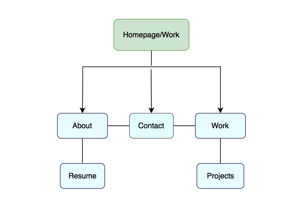
Navigation

This image shows one of my first iterations. At this point, I had only used HTML to create the necessary sections and containers before applying any styling.
HTML
Once I had my files organized, I created a sitemap to establish the hierarchy and navigation of my webpage and its content. Then, I began coding the basic structure for all of my pages while ensuring that I had the necessary elements for future styling. I included the header, body, main, & footer elements as well as image placeholders and containers for future columns and rows.
I took inspiration from my existing portfolio site and carried over my branding style. I updated my github after important changes.

Before my styling, I created this color palette such that I can convey a positive atmosphere that displays my light-hearted creativity. I used variations of lavender/purple to showcase my passion for design, promote a relaxed mood, and my blue shades to promote a calm vibe. For my body, I went for a sans-serif (Nunito) font in order to ensure readability. I also found it aesthetic.
CSS
I solidified my styling, including colors and fonts, and created an external stylesheet called “style.css” that I used to style my webpage. I linked the stylesheet to all of my pages, created unique ID’s for my sections, styled my buttons, and added viewport meta tags for responsiveness to different devices.


Adding styling to different button states.
For my buttons, I had to style at different states: active, hover, visited; these are crucial as they provide live feedback to the user as to how they are interacting with the site. I referenced my styling for use of color.
And for my elements, I implemented css properties that influence their positioning. With a better knowledge of positioning in css, I created solid layouts for my about and project page. I also included a footer– with easily accessible contact information– with a contact id as well as a way to view/download my resume.
Media Queries
Since I began with a mobile-first approach, it was now time to consider my layouts for larger screen sizes in greater detail. I learned how to utilize media queries to set breaking points for my different devices. I used my web inspector in order to set appropriate settings that would look good on mobile.
I tweaked my navigation elements so that they would shift in response to larger screen sizes, consequently dealing with adjusting padding and margin settings. Then, using my media queries, I specified settings for my columns, including % width length and float positioning.
Transitions and Animations
After learning how to do simple transitions and animations with the keyframes property, I went ahead and styled my buttons further. I added a smooth color transition for when the user hovers the buttons so that it’s color would not change rapidly but rather slowly. I also used an svg file, previously located at the bottom of my homepage, to demonstrate & practice my animation abilities; I made objects move points(x,y,z) at specific speeds in seconds (s).
Additionally, to add a better transition from my header to its box shadow, I decided to do a gradient and remove the blue background of my small introduction. This way, the layout would look more clean, aesthetic, and would avoid any confusion. I also reduced the text size so that users would see that my work is in my homepage during testing. I continued finalizing columns, spacing, and style on all pages.

Before

Before

After

After
Using Javascript & jQuery
After a strenuous, thorough refresher on JavaScript and its data types I used it to add more interactivity to the site. I predominantly focused on creating a menu that can be toggled for small screen sizes (mobile screens). For this, I hid the navigation elements for mobile devices and had them appear when the button was in use. I included the button font-icon in the navigation and had it float to the right. Then, using an if-else statement, I created a function that allowed interactivity with the menu. Through this, I got a better understanding of the base code vs the media query code. Mobile version images are shown below.

Code for responsive menu

Portfolio Site Homepage- Mobile

The menu in action
User Testing
To test my website, I recruited a total of 5 participants that fit this demographic…
Target users:
Age 20-40/50
Technical Experience: low-mid; comfortable with smartphones and laptop/desktop os or windows.
Device: owns a smartphone and/or laptop
Habits: regularly uses a smartphone to google information, shop, or watch videos. In the tech industry/ tech-industry bound
User goals:
Learn more about my project, Olive.
Discover my CV/Resume and professional network/linkedin.
Find my contact information/email.
Based on my user goals, I created scenario-based tasks which my participants had to follow. I walked them through the scenarios, asked open-ended questions, and analyzed the results– which were recorded for better analysis with the participant’s consent.
I used Jakob Nielsen’s severity scale to prioritize found errors:
0 = I don’t agree that this is a usability problem at all
1= Cosmetic problem only: need not be fixed unless extra project time is available.
2= Minor usability problem: fixing this should be given low priority.
3= Major usability problem: important to fix, should be given high priority
4= Usability Catastrophe: imperative to fix this before product release.
Recommended Iterations:

Future Iterations:
#1: Make sure the menu is responsive on all devices by testing the viewport and making sure the javascript function is working/ jQuery is correctly called.
#2: Code the logo as a link that takes the user back to the homepage. Also, add a personalized logo (had left this feature out for quick testing).
#5: Make the “work” button link to the middle of the page, where my listed projects begin (like the contact section link for the footer).
#3: Fix any padding/margin issues with the header so that you can’t see the page scrolling behind it at the top.
#4: Consider moving the resume into the menu for easier access.
Code Quality, Crowd-Browser testing, & Linters
After implementing my iterations based on findings, I decided to test my website on multiple browsers and devices to make sure the accessibility was on point. Before beginning to test on different browsers, I made sure I had good code-quality. First, I ran my code through the wc3 validator and fixed a few issues until they gave me the green light on every page. Once I installed code linters– atom beautify, wc3-validator, linter-stylelint, linter-js-standard– I would ensure that my code had easily readable code, a consistent code style, and was free of misspellings and ambivalent syntax.
I decided to test my site on modern browsers including Chrome, Safari, Firefox, Edge; I tested it on Desktops, Windows, iPhones, iPad, os tablet, Samsung, os. Then, I also made sure that my color contrast ratio was good so that my text was easily readable.

Checking in with the wc3 validator.

Making sure my color’s contrast ratio was good.

Double-checking with atom linters.
After testing on multiple devices and browsers, I found slight errors only on Andriod OS. I’m currently solving this issue and will push the commits to github in the near future.
Solution
I succeeded at coding a responsive portfolio website to showcase my projects. Although it’s a pretty basic site, I am proud of the responsiveness and features that I created for it. I want to keep improving on it to see it grow.
I will continue to test my site on browsers and devices as I make future iterations to ensure that the accessibility remains intact. I also plan on adding a personalized animation at the bottom in place of what I had on display; beach waves sound like a great idea.
All in all, I believe I am more fluent in front-end development than I was before. I hope to keep learning my iterating on my site and practicing using more properties!
Future Iterations
Aside from continuing to test my site on more devices, I plan on adding more navigational elements to my project pages. This way, users would easily be able to navigate through each of my projects– whether it is to read about my user testing or to checkout my high-fidelity prototypes!
Link to my site: https://melissalopezux.github.io/portfolio_website/
~ Thank you ~